My first blog post, and creating violin bloomplots as player radars.
Statsbomb (and the SBNation blog BarcaBlaugranes) introduced me to xG, radars and distribution plots 2-3 years back. At that point, not only was I unaware that there existed statistical research in the field of football, I also had no idea about the thriving world of data visualization. I used to code only for my own research - solving differential equations and all that.
Since then, it’s been quite a journey. Over the last year and a half, I have been picking up a bit more of coding and visualization skills (almost 100% dedicated to football). Not that I am any good right now - my stuff still looks amateur. But any progress from zero is progress, right ?!
Anyways, radars have always fascinated me - despite their shortcomings both as a visual medium and as an evaluation tool for players. I think it’s a pretty nifty compact way to showcase a lot of interesting data. The data could be indicative of style, or be an actual quantitative measure. But as a visual medium, I think they are nice. Also, the idea to put distribution plots right next to the radars was a masterstroke by Statsbomb. Showing how the entire population of players is distributed for certain stats is quite important, I think. So, I decided to investigate how these were created in Python. And I came across this library called seaborn (this is from a year and half ago). And seaborn led me to violin plots - symmetrized versions of the distributions. Really really cool looking plots - except they didn’t look like violins to me. They always looked like leaves to my eyes. But I didn’t think much about all of that back then.
It’s only recently that this equivalency with leaves came back to haunt my mind one fine night I was trying to sleep (of course it had to be when I was trying to sleep…how else can someone’s peace of mind be ruined more effectively !!) And I thought about it for a while, discussed a bit with my favourite person on twitter Jon Ollington, and then created this 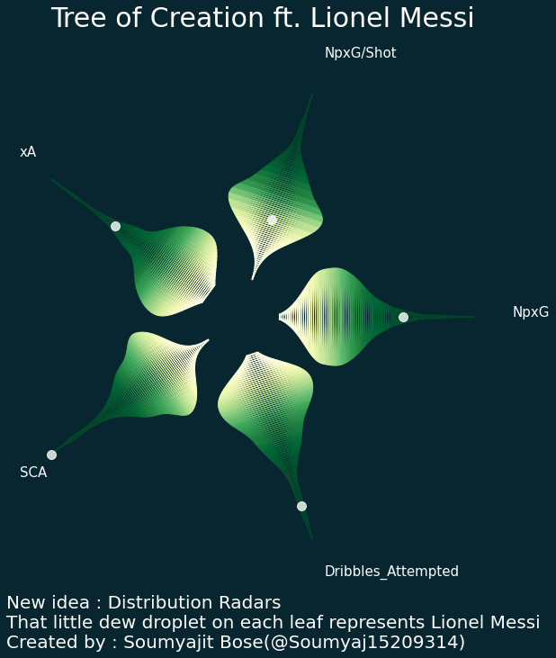 .
.
In this post, I will briefly describe how I created this. I quite like it, even though its mostly art, and I won’t use it in professional settings. There can be tons of improvements obviously.
Firstly, you want to grab data for a group of players. Don’t choose more than 5-6 stats; it will end up cluttering the viz, and art is the point behind this creation. After that, you want to create the violinplot and extract the coordinates. The following can grab the coordinates for you. “qty” refers to the quantity you are creating the violin for - could be NpxG per 90 or Shot Creating actions per 90….anything you want it to be. “player” is the Player you want to highlight.
def violin(qty,player):
    fig, ax = plt.subplots()
    Df = dataframe.copy()
    Df = Df.sort_values(by=qty).reset_index(drop=True)
    upper = Df[qty] <= Df[qty].quantile(1.0)
    lower = Df[qty] >= Df[qty].quantile(0.0)
    Df = Df[upper & lower].reset_index(drop=True)
    Df['percentile'] = Df[qty].rank(pct=True)
    violin = ax.violinplot(Df[qty],vert=False,showextrema=False,showmeans=False)
    path = Path(violin['bodies'][0].get_paths()[0].vertices)
    X = path.vertices[:,0]
    Y = path.vertices[:,1]
    Y = Y - Y.mean()
    Xnew = (X - X.min())/(X.max() - X.min()) + 0.2
    plt.close()
    rank = [len(Df[Df[qty]<x]) for x in X]
    z = np.array([r/(len(Df)-1) for r in rank])
    xplayer = Df[Df.PlayerNameSquad==player][qty].values.item()
    xplayer = (xplayer - X.min())/(X.max() - X.min()) + 0.2
    return X,Xnew,Y,z,xplayer
Once you have extracted the coordinates, you want to redraw the violin, and color based on percentiles using a cmap. The coloring is done by adding closed filled polygons. The following will do that for you : it will first assert that you are only choosing 5 quantities to plot, iteratively call the violin function, extract the coordinates, add a translation and a rotation to orient the leaves properly, then color them based on the percentile rank. Note that I haven’t reversed the distribution for negative attributes here….but it should be a trivial change.
#### statcols is a list of names for the stats you want to depict. Eg. ['xG','xA','SCA','Passes','Shots'].
#### These are column names in your dataset, needless to mention.

if len(statcols)>5:
    statcols = statcols[:5]
len_stat = len(statcols)

angles = [2.0*np.pi/len_stat*i for i in range(len_stat)]
fig,ax = plt.subplots(figsize=(10,10))
for i in range(len(angles)):
    angle = angles[i]
    cs = np.cos(angle)
    sn = np.sin(angle)
    qty = statcols[i]
    X,Xnew,Y,z,xplayer = violin(qty,player)
    Xp = Xnew*np.cos(angle) - Y*np.sin(angle)
    Yp = Y*np.cos(angle)+Xnew*np.sin(angle)
    radius = np.sqrt(Xp**2 + Yp**2).max()
    ax.text((radius+0.2)*cs,(radius+0.2)*sn,qty,color='w',fontsize=15)
    Xp1 = Xp[:len(Xp)//2]
    Xp2 = Xp[len(Xp)//2:]
    Yp1 = Yp[:len(Yp)//2]
    Yp2 = Yp[len(Yp)//2:]
    Xp2 = Xp2[::-1]
    Yp2 = Yp2[::-1]
    ax.plot(Xp1,Yp1,color='none')
    ax.plot(Xp2,Yp2,color='none')
    ax.scatter(xplayer*np.cos(angle),xplayer*np.sin(angle),color='w',alpha=0.8,
               s = 100,zorder=10)
    npts = len(Xp)//2
    cmap = mpl.cm.YlGn
    normalize = mpl.colors.Normalize(vmin=z.min(), vmax=z.max())
    patches = []
    for j in range(npts - 1):
        polygon = mpl.patches.Polygon([[Xp1[j],Yp1[j]],[Xp1[j+1],Yp1[j+1]],
                                       [Xp2[j],Yp2[j]],[Xp2[j+1],Yp2[j+1]]],
                                      closed=True,
                                      color=cmap(normalize(z[j])))
        ax.add_patch(polygon)

ax.set_aspect('equal')
ax.set_facecolor('#082630')
fig.set_facecolor('#082630')
ax.set_xticks([])
ax.set_yticks([])
ax.set_title('Tree of Creation ft. Lionel Messi',fontsize=30,color='w',
             pad=50)
for sp in ['top','bottom','left','right']:
    ax.spines[sp].set_visible(False)

ax.text(-radius,-radius-0.5,'New idea : Distribution Radars'+'\n'+
        'That little dew droplet on each leaf represents Lionel Messi'+'\n'+
        'Created by : Soumyajit Bose(@Soumyaj15209314)',
        fontsize=20,color='w')
That’s it. Hopefully this helps !! If you find something broken, let me know. Also, once you get the idea here, you can create more artistic stuff like this : 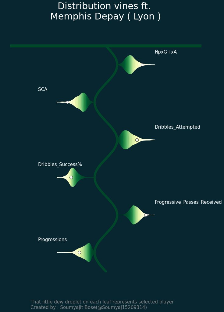 . All you need to do is extract the coordinates from the original violin, then translate/rotate/do whatever and present it as some artform.
Finally, Andy Rowlinson (one of my favourite persons on twitter ) and the creator of the wonderful mplsoccer package - practically a god-sent gift for Pythonistas (god being Andy) has decided to add a very similar version to mplsoccer. He also allowed me to try it out first. It’s called a Turbine Plot (the name probably comes from Vinay Warrier; can’t remember). Here is a sample 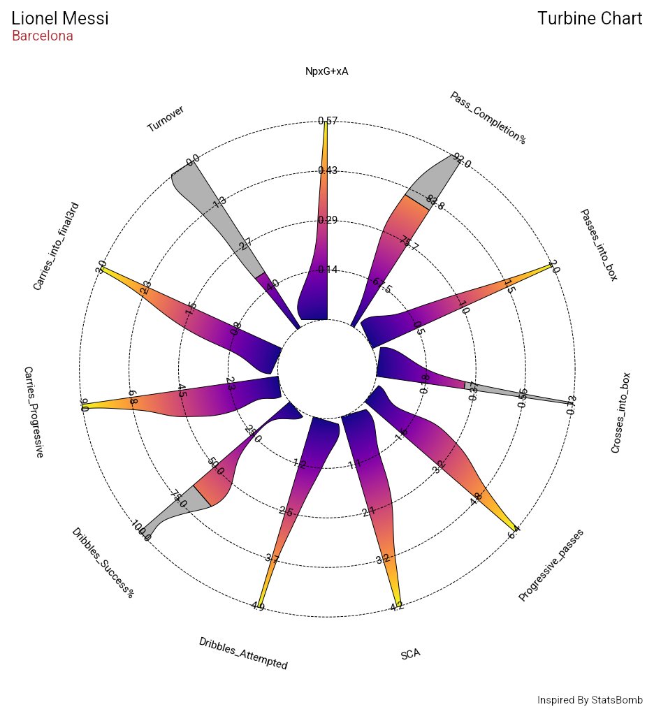 . It will become public on mplsoccer pretty soon.